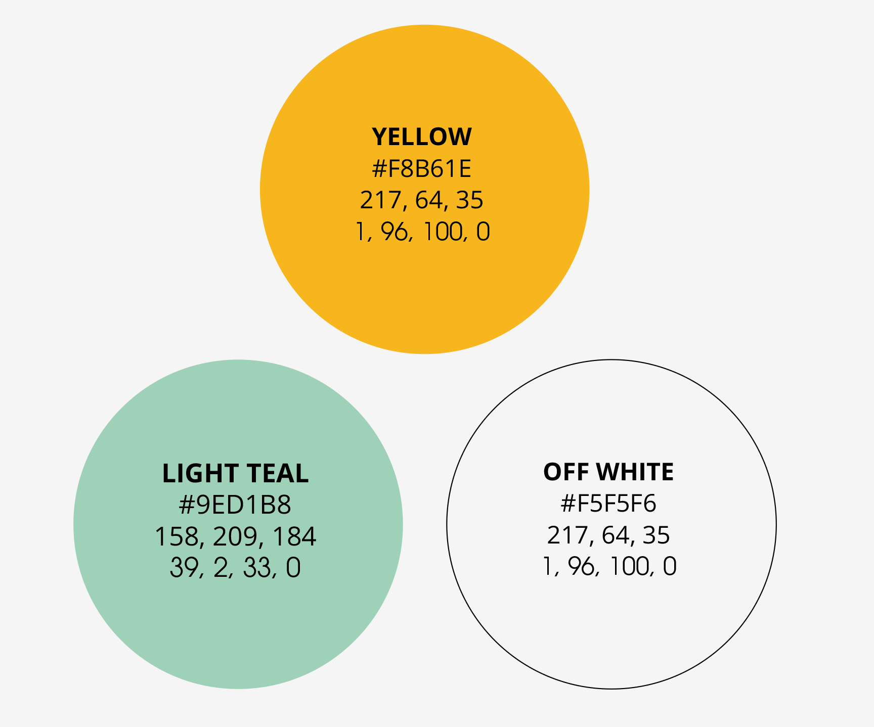
Creating a differentiating brand
Lab45 was formed to transform tech consultancy, Wipro, into a dominant player in the technology space and prepare it for the future of enterprise. The practice does this through innovation, thought leadership, incubation, advisory, new-business models, and non-linear revenue streams – in both mainstream and emerging tech. Unlike their competition, who push products or services onto customers that may not meet their needs or may become obsolete in the near future, Lab45’s fully-functioning innovation lifecycle allows for the scalability, flexibility, knowledge, and expertise to, not just push the limits of innovation, but do so in a dynamic and purposeful way. In order for Lab45 to position themselves in this way, they needed an updated brand that reflected their modern approach.
As Group Creative Director at Designit, I oversaw a team of creative directors, designers, and copywriters using competitive research, audience data, and collaborative branding workshops to develop a tagline, logo, and guidelines for this refreshed brand. Upon launch, the brand will establish Lab45 as a purposeful differentiator in the tech space.
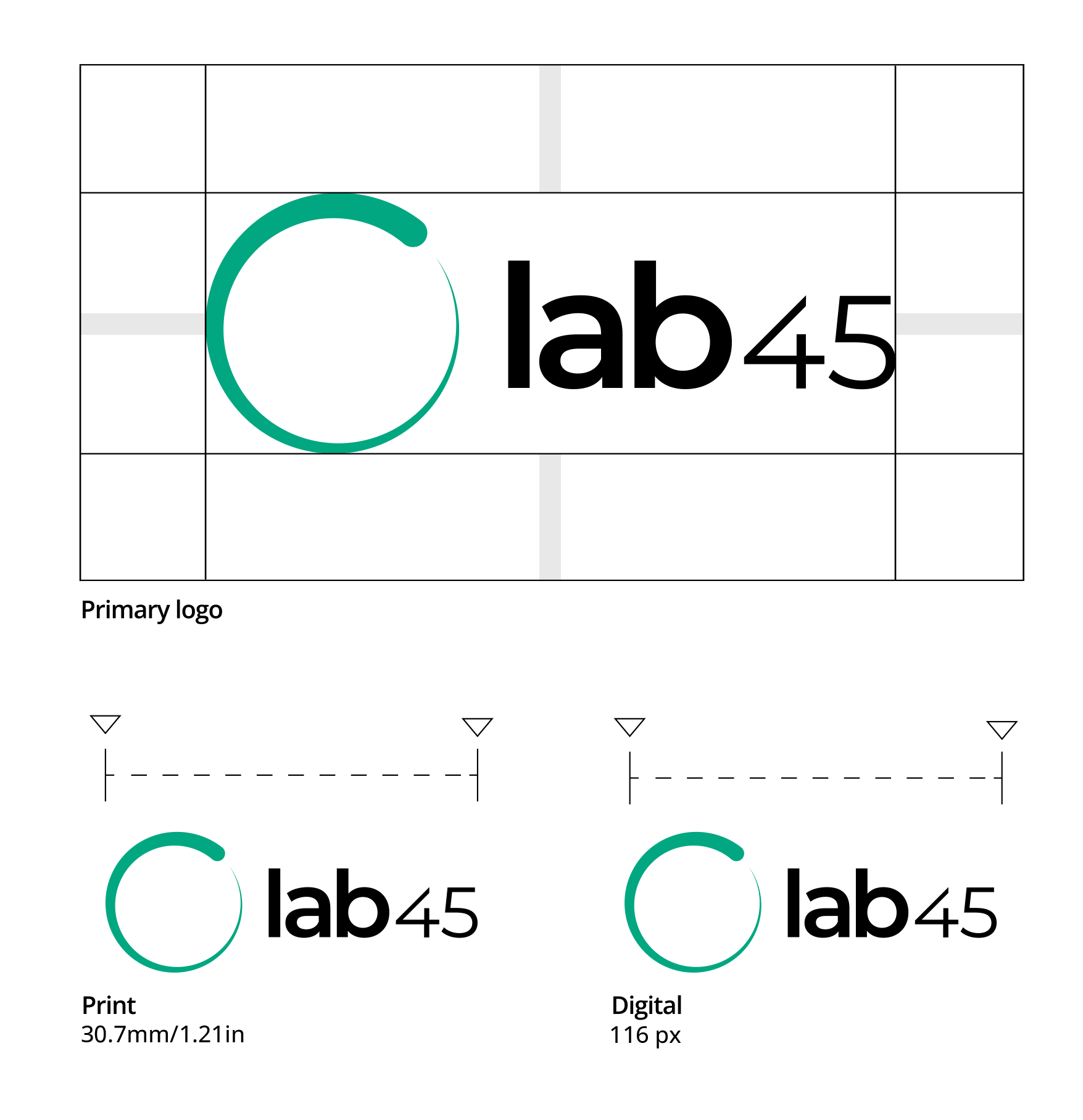
The new logo, inspired by the Ouroboros, represents an eternal cycle of creation and destruction. Lab45 is known for boundless-forward thinking, which lends itself to the eternal cycle of creation and innovation. The logo mark is designed to be a unique, sleek, and visually intriguing symbol of steady growth, highlighting Lab45’s flexibility and agility. It’s also a nod to Wipro, Lab45’s parent company.